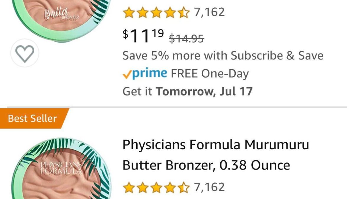
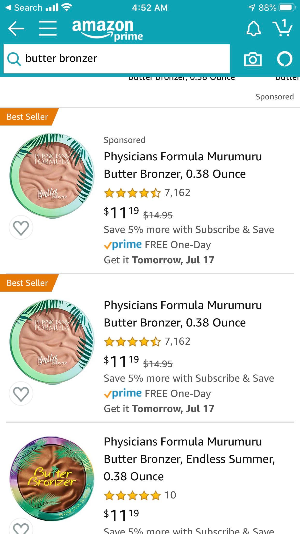
Kinda sad because the butter bronzer packaging is quite memorable by now, but ngl the new Butter bronzer font kinda is… better-looking without it lacking personality (i.e. all luxury brands now using the exact same font like YSL, Burberry, Celine, etc.)
Kinda sad because the butter bronzer packaging is quite memorable by now, but ngl the new Butter bronzer font kinda is… better-looking without it lacking personality (i.e. all luxury brands now using the exact same font like YSL, Burberry, Celine, etc.)
Can’t tell if it still looks super bulky. Personally I love the look of this new packaging. Colour and font is calling my name
It better be slimmmmmmmm
i think it looks better now, i just hope they made it less bulky
Is there a side view? I’m hoping this packaging is slimmer and doesn’t include the useless foam applicator!
I hope the formula stays the same. Although I’m so pale it’s a bit too orange for me.
Ooh I actually really like the new packaging. I might even consider buying this now, was never onboard with the old packaging.
I love the old design but I’m hoping the new one is slim and not as bulky. It’s the only thing that stops me from repurchasing it.